Friday, October 29, 2010

Late coming self -introduction

Name : Weiting Wong
Student ID : 1102702417
Age : 18
D.O.B : 16 / 08 / 1992
Hometown : Johor
Email : weiting816@gmail.com
Facebook : www.facebook.com/im.still.weiting

Above are some basic introduction of myself and I hope that at least it will let you know somethings about me.For more your information :

I'm 
- from single-parent family but live in happily and happiness

- prefer chocolate than candy
- prefer daisy than rose
- contented with what I have now
- currently living in Cyberia Smarthomes, Cyberjaya.
- noob in drawing
- fans of TVXQ! and JYJ.
- gonna own a DSLR soon and I look forward to it.
- heading to Media Innovation or Interface Design when in degree
- hope that I can ‘digest' well in what have been taught in this semester 


Nice to meet you all...:D

Tuesday, October 26, 2010

Tutorial 3 : Gamut Warning

For week 3 tutorial, we had learned about Gamut Warning/Gamut Color .So, what is Gamut Warning?


A gamut is the range of colors that a color device can display or print. A color that may be displayed on your monitor in RGB may not be printable in the gamut of your CMYK printer. For instance, the nice blue on your monitor that prints as purple.

Photoshop has its own color management system that uses your printer profiles to automatically bring all colors into gamut that will print to that profile’s range of colors. But you might want to identify the out-of-gamut colors in an image or correct them manually before printing to your desktop printer or converting to CMYK for a professional print job.

It's important when you go to print. If your printer can't output the colours that are present in the image then you may be in a bit of a bind. Turning on the Gamut Warning (View>Gamut Warning) will help by giving you a visual reference (on screen) - providing a colour overlay on the problem areas. You can then fine tune these areas to "bring them into Gamut."

It can be a bit of a distraction to leave it on all the time, so you may want to save it for when you are about to print.


Below are the steps on how to solve the Gamut warning :

1.Open a copy of the your image.This image is download from MMLS.You may try this on any other images. 


2. Press Shift + Ctrl + Y to access "Gamut Warning" or you can find it in "View >> Gamut Warning".

3. All pixels that fall outside of that particular profile’s gamut will be highlighted.


4. Choose " View >> Proof Setup " , choose the proof profile you want to use. In this case, CMYK proof space is chosen by default.


5. Create a new Hue/ Saturation adjustment layer.
DO NOT edit the image using the " Edit: Master " color option. If you do, the whole image will be desaturated, not just the color problem areas. Slightly drag the Saturation slider to the left and notice the decreasing of grey-highlighted part until it disappear.

【*Note : Notice the color areas that are covered with the gamut warning.  If the image has a number of different colored areas that need desaturating, work on them individually (i.e., yellows, blues, greens, etc.)

 Eg.:

i. Drop down the option box to select the color you wish to adjust first.In this case, I choose Blue color and change it saturation.Can you see the different? The grey part disappear.


ii. Next, change the Magenta color part.Changing the other color one by one until all grey part is totally disappear.   


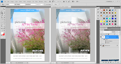
6. After the grey-highlighted part is totally disappear, it considered finish. Click on the "Arrange Documents" icon on the application bar and choose " 2 Up " to compare and see the different between before and after.
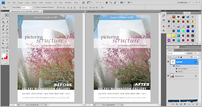

Change the saturation of each color one by one until the grey-highlighted part disappear.
Before and after Gamut Warning.

 Work done.

Tutorial 2 : Working with layers

Week 2 tutorial is about working with layers. This is quite important when we create our masterpieces.The layers give the subjects we created a level of different view. We can also modify the certain subjects with some effects in certain layer.


First of all, sure we need to create a new file [Ctrl + N].Set a file name and size of canvas that you need. 

This is how it exactly look like after you create a new canvas.

Double click on the background layer to unlock it, change the layer's name from "Layer 0" to "background" so that it will be easier to differentiate.

Click on the "Create a new layer" button or press Shirt+Ctrl+N to create a new layer.

Use the Rectangle Marquee Tool to draw a rectangle or create any shape you like by other tools. Press Shift+F5 to fill in any color or pattern to the rectangle outline shape that we create just now.You may change the blending mode or opacity as you like.

Create a new layer, right-click >>Layer Properties to change the layer's name and draw another shape you like and fill it up with color or pattern as above.

Press T or click on the "T" letter on the tool panel to activate Type Tool.Type any words you want.For your information, anything that being type will have a own text layer.   

If you don't like the color being fill just now or you want change it to pattern.Press Ctrl and click on the layer thumbnail to load selection and then press Delete key to clear the color filled.Fill in again with color or pattern you like.

Then change the rectangle to rounded-rectangle by modify the feather of edges[ Shirt+F6 ]. I'm applied 10 feather radius pixels in this work. After we modify the feather of edges,we can see the selection loaded become rounded. Select >> Inverse >> Delete to apply the roundness to the subjects. You may change the background by drag into another picture you want or fill it in with pattern/color as your wish and you can change the mode and opacity to make the background look nicer. This action can be done directly on the background layer because we had unlock the background layer at the beginning. If you don't want to unlock it and prefer to keep a lowest layer for any other changes. You may create a new layer on the background layer.

Create another new layer and fill with brushes that suitable for your masterpieces. It would be encourage if you apply each brushes on each layer so that you can changes/modify/delete it separately without changing other, 

And lastly,don;t forget to add your name/copyright/watermark onto every masterpieces that you have done to prevent any copy.

Finish.

click to view full size.

Tutorial 1 : Getting to know the workspaces of Adobe Photoshop

No matter what we are doing, the first and important things is to recognize the surrounding. This theory also applied in learning process.Before we start to learn/use Adobe Photoshop, we should know and get usual with its workspaces first. It would help to reduce the problem we might face and also reduce down the time using for learning tutorials.

Below is the print screen of The Workspace of Adobe Photoshop CS4 Extended version.

[click to view the bigger me.:D]

Refer to this site if you have any doubts or problem about the Adobe Photoshop workspace : 
http://help.adobe.com/en_US/Photoshop/11.0/WSfd1234e1c4b69f30ea53e41001031ab64-750da.html

------------------------------------------------------------------------------

Here are the introduction of Adobe Photoshop Tool Bar.


Unraveling the mysteries of Photoshop Tool Bar and it’s resident icons.They are not as scary as they look !