Tuesday, October 25, 2011

Environmental Design : Information Counter and Information Kiosk Studies 2

Information kiosk : 

Venue / Location : Sunway Pyramid

Type 1 :
Front view.

Overall.

Close-up of the Information Kiosk.

Type 2 :
Side view.

Front view.

Overall view with users still interacting with the information kiosk.

The information kiosk is just a big rectangular board with the internal setting LED display which user can only perform one way interaction with it - only can see the information displayed on the kiosk and cannot type/search/communicate with it. There are a floor plan graphic displayed on the kiosk which is nice to show that which area are the user currently in and let user know that where and which direction should them go if they want to go another atrium. The overall design is too dull and hard to search for the information that user want to have because user cannot type a single words and interact with it. The placement of type 1 information kiosk is too high and those user whom are not so tall maybe too hard to see the content displayed at the upper part. Yet, type 2 information board is too slanted and too high also. The way the information kiosk slanted indirectly cause the user need to cross a step and bend down their body to see through the information clearly. Overall, I do think there is a big room of improvement for these two design.

Sunday, October 23, 2011

Environmental Design : Information Counter and Information Kiosk Studies

Information Counter : 

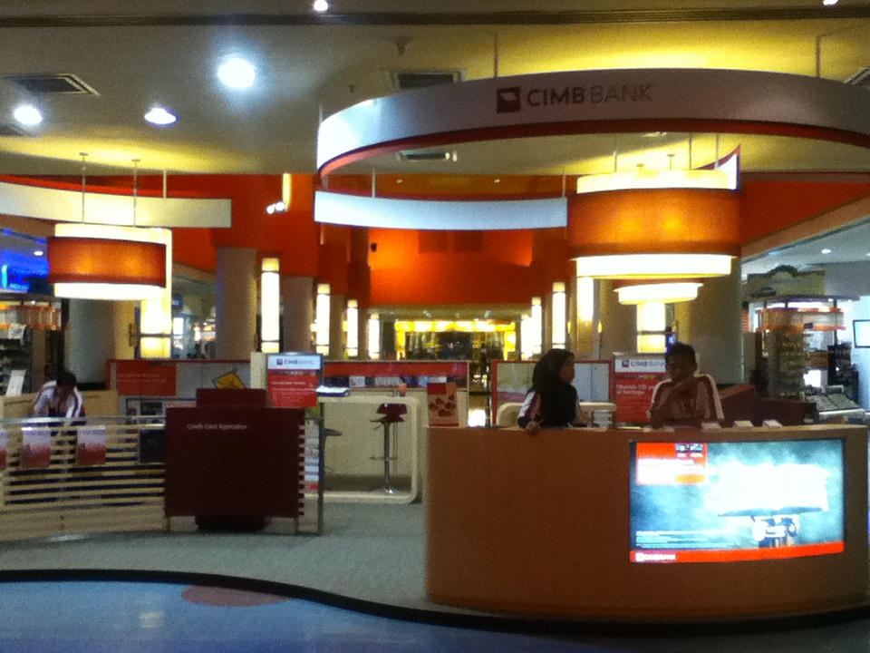
Venue / Location :  CIMB Bank Information Counter Booth at Sunway Pyramid


Front view.

Side view.

Side view.

Inner site view.

The overall design are in circular pattern. It is easy to see that the whole design for the booth is well follow the circular way of flow and it's in smooth circulation. If we neglect the other part of the information booth and only emphasis on the information counter, you can see that the information counter was in curve shape and compatible with the overlapping circle layers lamp which located on the top of the information counter and the half-circle shape banner.

The information counter itself is well follow the whole concept for the booth and it is well arranged at the edge of the booth covered area. The design of the information counter is quite simple with only one big screen inserted at the left side of the information counter and nothing else beside it. This could be the concept of "less is more", since the information counter is a place for other to ask for information nor looking at their design. And, the importance information and design is emphasis in the flyer/brochure that being put on top face of the information counter.

Lastly, I think the design of this information counter is suitable and appropriate with the location and brand. There are only one screen at the information counter for the purpose of screened out the graphics. The curve design of the information counter suit the location itself which at the corner of the shopping mall which the passers-by would like to turn around to other side. It's easier for the passers-by to walk across it while have a look with it. Thus, I think it is quite a suitable design.

Saturday, October 22, 2011

Announcement : New Usage Added-in

Hi ! Everyone,

This blog - I Blog What I Learn will be used as the blog showing progress of learning of my Environmental Design subject also. All the work-in-progress for this subjects will be updated here and the comment about require topics will be answer here also. Do stay tuned and drop by often for lastest updated.

Thanks. =)


Regards,
Wong Wei Ting
1102702417