Wednesday, January 12, 2011

Group Work : Making of calender - [ August ]


On the psd. file of calender template, create a new layer and name it as "sky gradient".

Using Rectangular Marquee Tool to draw a rectangle and grab the Gradient Tool from tool box and fill the layer with light blue.

Use a darker blue to do a gradient fill again as shown below:

Create a new layer called “cloud”, and use the cloud brushes to paint some cloud on top of the gradient layer.

Drag the grassland image into the canvas and name it as "grass field". Ctrl + T to access Free Transform and adjust it to fit the size of calender and place it as below.

Add a layer mask onto the grass field layer and use Eraser Tool with soft brush to erase the upper part of image. 

Open the image of mountain and use Quick Selection Tool to select the wanted image out of background and right-click >> Feather >> feather =5 pixels to smoothen the edges. 

Drag the selected image into the calender document and name it as "mountain".Place it under the Sky gradient layer.

Drag a river image into the calender document ,name it as "river" . 

Add a layer mask onto it and erase the unwanted grass part. Left only the river part.


Open the refer image and use Quick Selection Tool to select the bridge out of background, right-click >> Feather >> feather =5 pixels to smoothen the edges. 

Drag the selected image into the calender document and name it as "bridge". Ctrl + T to adjust the size of the bridge and also change it position. Press Alt while transforming the bridge to change it level position to make the bridge look more like close to the grass field .

Adjust the color balance to a bit greenish to make the surround look fresher and harmony.

Open the image of accordion. Duplicate the layer and Filter >> Other >> High Pass ,change the blending mode to overlay to make the image clearer.

Using Magic Wand Tool to select the accordion out of its background and feather it and drag it into the calender document.Name it as "accordion".

Create a new layer under accordion and name it as "shadow".Using soft brush with black color to paint some shadow of the accordion.Change it opacity to 40%.

Duplicate the river layer and place it onto accordion's layer. Add a layer mask onto it and erase unwanted part to make the accordion look like drop into the river.

Using Horizontal Type Tool to add date and month onto the calender and also holidays.

Adjust the color balance again so that it look more compatible within all layer and lastly I create a new group and place all layer into it and name it as "calender image".

Here is the outcome : 


Tuesday, January 11, 2011

Group Work : Making of calender - [ July ]


Open the calender template, load the “Desert” stock image into Photoshop, copy and paste the entire image onto calender document, position it at bottom of calender.

Name the new layer as “Desert”, add a layer mask onto it. On the layer mask, use the “Mist Brush set” erase the top part of the image.This will form a nice misty effect for the image and make it easier for the layer blending later on.

Duplicate this “Desert” layer once and on the duplicated layer, go to filter >> blur >> gaussian blur >> 2.1 pixels.

Change the blending mode of the duplicated layer to “Screen” and drop its opacity to 70%, you will have the following effect:

Adjust Color Balance, Curves, and Levels to make it more contrast.


Load the “Sunset Sky” image into Photoshop, copy and paste it onto our document and name this new layer as “sky”, resize and position it as shown below:


Add a layer mask to this sky layer, on the mask, use a soft round brush to gently erase the bottom part of the sky layer.

Add the following two adjustment layers to the sky layer, make sure to tick “use previous layer as clipping mask” option.
Color Balance :
Curves :

Then duplicate the original Sky layer once and drag it to the top. On the first duplicated sky layer, apply motion blur >> angle = 0 , 45 pixels .

After applying the motion blur filter, duplicate this layer once and change the duplicate layer’s blending mode to “Hard light”

Open the image of dulcimer, duplicate it and apply Filter >> Others >> High Pass = 10 pixels and set its blending mode to overlay to make the image look clearer.

Merged all layers and use Magic Wand Tool to select the image out of its background. Feather >> feather radius =3 pixels .

Drag it into calender document and name it as "dulcimer".

Ctrl + T to access Free Transform, hold down Alt and Shift to transform the dulcimer to make it more real.

Add a layer mask on it and erase some part of dulcimer stand to let the dulcimer seem like down to the desert. Create a new layer name as shadow and use soft brush with black color to draw some shadow behind the dulcimer stand,adjust it opacity to 20 %.

Create a new layer called “Sparkle” under dulcimer layer.Load the “Star Brush set” and use it to paint around the dulcimer to create some sparkling effect 

Duplicate the “Sparkle” layer once, and apply Radial Blur .

Name this layer “Radial” and set its blending mode to “overlay” and duplicate it one more and Ctrl + T to adjust the position of its.

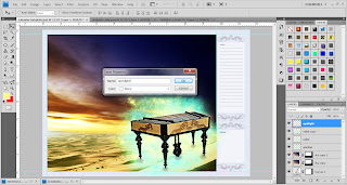
Create a new layer on top of all layers, name it as "spotlight". Then, use Pen Tool >> Shape layers to frame a triangle-like shape from upper-left corner. 

Right-click >> make selection and feather it as 55 pixels. Shift + Ctrl + I to select inverse, rasterize layer and use Eraser Tool to erase the selection's edge to make the edge smoothen. Set its blending mode to overlay and add a layer mask to erase the part that cover dulcimer.

Drag the musical notes image into the document and name it as musical note 1.Place it as suitable place and set its blending mode to Screen. Then, open another musical notes image and select it out of background. Drag it into calender document and place it nicely. Set its blending mode to Linear Burn.

Adjust the curves and color balance for dulcimer and merged the layers up to make sure that the action only apply to dulcimer layer only.

Lastly, use Horizontal Type Tool to add date and month onto calender. Holidays and name also added. Change its blending mode to get different effects.Calender finished!~

This is the outcome : 

Thursday, January 6, 2011

Group Work : Calender Template

Create a new file, set it as A4 size with 300 resolutions.Name it as "calender template".

Drag the guide lines to divided the space evenly. 

Using Rectangular Marquee Tool (M) to draw a rectangle within guide lines. 

Shift + Ctrl+ I to select inverse, create a new layer and name it as "texture background".

 Press Shift + F5, fill up with musical note pattern. 

 Double-click on the layer thumbnail to access Blending Options >> Color Overlay. Change the color of filled-up texture background with blue color.

Change the layer's opacity to 30 % . Below is the outcome so far.

 Create a new group and name it as "florid border".

Open Adobe Illustrator and choose a symbol from Florid Vector Pack and import it into Photoshop. 

Place it as vector smart object under the "florid border" group. Adjust the size and place it as suitable place. Name the layer as "florid border".

Duplicate the layer three times and place it as like below.

 Create a new layer and name it as "note background" and use Rectangular Marquee Tool to draw a rectangle and fill it with white color , 50 % opacity.

Create a new layer and name it as "holiday background" and use the same method as just now to create a smaller white background for the holiday part.

Create a new layer and name it as "note line" .Using Pen Tool >> Paths to draw a line on the note background. Pressing Shift to make sure the line is straight. Right-click >> Stroke Path >> Pencil and remember to tick the Simulate pressure box.

 Duplicate the line and arrange it nicely to become note pad.

Using Horizontal Type Tool to add text on the template.

Create a new group and name it as "Date" .Using Horizontal Type Tool to type the date and month onto the template under the "Date group".

Lastly, I create a new group name "template" and place all the layer and group created just now into the group folder so that it look more neatly and not mixed with the calender image done by us later.


Finally, the template is DONE!!~ This is how it look like :